Edition
Ideas Too Good to Ignore: Creative Work That Stands Out

Agency Spotlight: Branding That Slaps
Branding That Slaps is an agency that specializes in creating visual identities that break through the noise, leaving a lasting impact. Their approach combines bold design, sharp messaging, and strategic storytelling to help brands stand out in an oversaturated market.
What sets them apart is their ability to craft branding that doesn’t just look good, it feels powerful. With its high-energy typography, every project they touch has an unmistakable edge. Their work spans industries, proving that they can work with a startup or an established brand, and their goal is to deliver a fresh, dynamic identity can change the game.
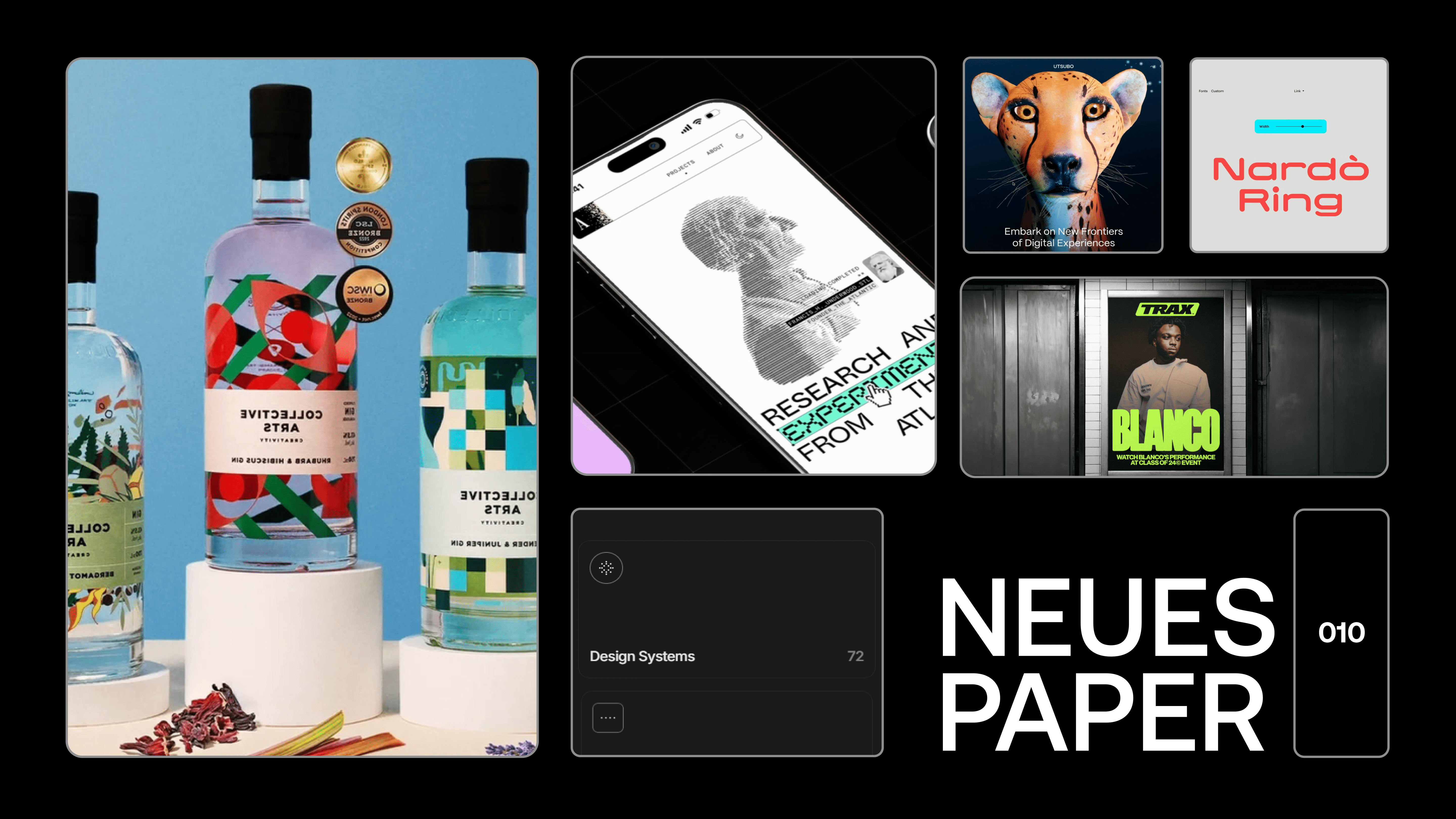
Branding Inspiration: The Atlantic by MetaLab
When an institution like The Atlantic a publication with over 167 years of history decides to evolve, it requires a branding approach that respects its legacy while embracing modernity. The reached out to MetaLab, the design agency behind the publication’s digital transformation.
This rebrand is about refinement not reinvention. MetaLab preserved The Atlantic’s intellectual depth while enhancing its digital presence with a user-friendly, visually compelling design. The result? A balance between tradition and contemporary usability. From typography choices that nod to classic editorial layouts to intuitive digital experiences that keep readers engaged, every detail speaks to a seamless blend of past and future.
Website Feature: Utsubo
Utsubo is a website that is great at designing with a minimalist yet immersive approach, their site seamlessly blends high-fashion aesthetics with digital interactivity, creating a space where visuals and motion guide the user journey.
The site’s standout feature is its fluid, scroll-driven animations, which give the impression of effortless movement. Each element is carefully choreographed, reinforcing Utsubo’s identity as a brand that values precision and elegance. The use of striking typography and muted color palettes adds to the refined feel, making every interaction feel intentional.
From the moment you land on the page, Utsubo’s website sets a tone of exclusivity and high design. It’s a perfect example of how a digital presence can elevate brand perception through storytelling, motion, and a keen sense of spatial awareness.
Font Spotlight: Link by Faire Type
Link by Faire Type is a modern sans-serif that balances geometric precision with humanist warmth, making it a versatile choice for branding, editorial design, and digital interfaces.
Designed with clean lines and subtle personality, Link feels contemporary without being sterile. Its letterforms feature slightly rounded edges and refined proportions, ensuring readability while maintaining a distinct character. The typeface is available in multiple weights, offering flexibility for both bold headlines and delicate body text.
One of Link’s standout features is its ability to adapt seamlessly across different design applications from high-impact posters to sleek UI elements. It’s the kind of font that feels effortlessly sophisticated, making it a go-to for designers seeking a modern, approachable aesthetic.
Creative Resource: Design Systems Surf
Design Systems Surf is a curated platform dedicated to the best design system resources, tools, and frameworks available today. Whether you're building a system from scratch or refining an existing one, this site offers a deep well of inspiration, documentation, and best practices for creating scalable, cohesive designs.
The platform aggregates insights from top-tier design teams, covering everything from UI kits and accessibility guidelines to component libraries and workflow strategies. By showcasing real-world examples from companies like Google, IBM, and Shopify, Design Systems Surf provides a practical roadmap for designers and developers looking to streamline their process.
For those navigating the complexities of maintaining consistency across digital products, this resource is an essential bookmark. It distills the most effective strategies for structure, collaboration, and efficiency, making it a powerful tool for modern product teams.
Image Inspiration: Saturn_PNG
Saturn_PNG is a digital artist whose work exists at the intersection of nostalgia, surrealism, and hyper-modern aesthetics. His compositions blend retro-futuristic elements with bold, dreamlike visuals, creating pieces that feel like fragmented memories from an alternate timeline.
Through a masterful use of textures, neon-infused palettes, and layered compositions, Saturn_PNG crafts imagery that resonates with both digital and print design enthusiasts. His work often draws from pop culture, sci-fi, and cyberpunk influences, making each piece a visual exploration of time, technology, and imagination.
For anyone seeking inspiration in collage-based design, glitch aesthetics, or experimental visual storytelling, his Instagram feed is an endless source of creative energy.
It’s a wrap!
As always, we hope these curated insights and inspirations help spark ideas for your next project. Stay tuned for more next week as we continue to explore the latest in design, creativity, and innovation. We will keep curating these gems for you, so stay inspired and keep exploring.
.svg)
.png)


